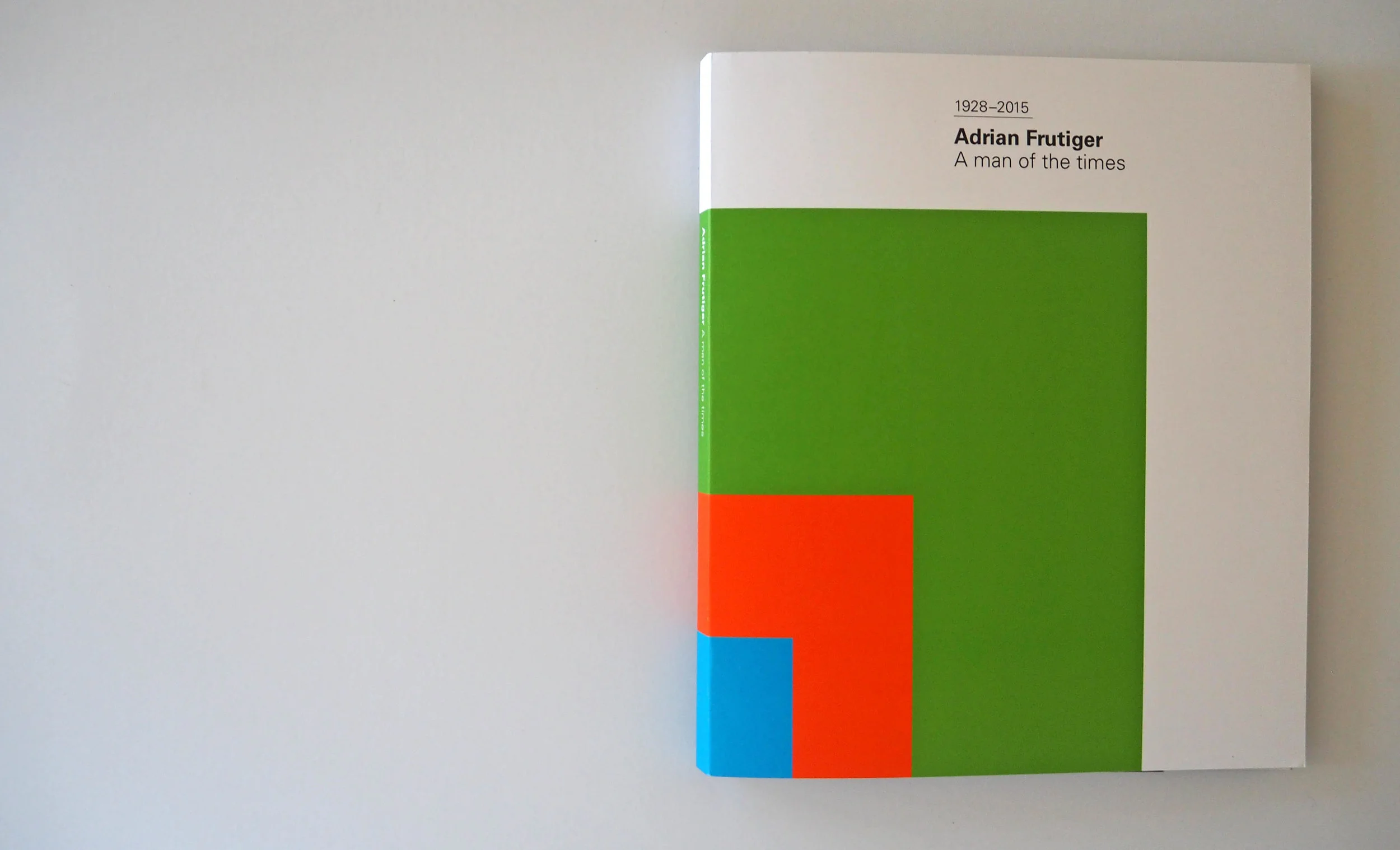
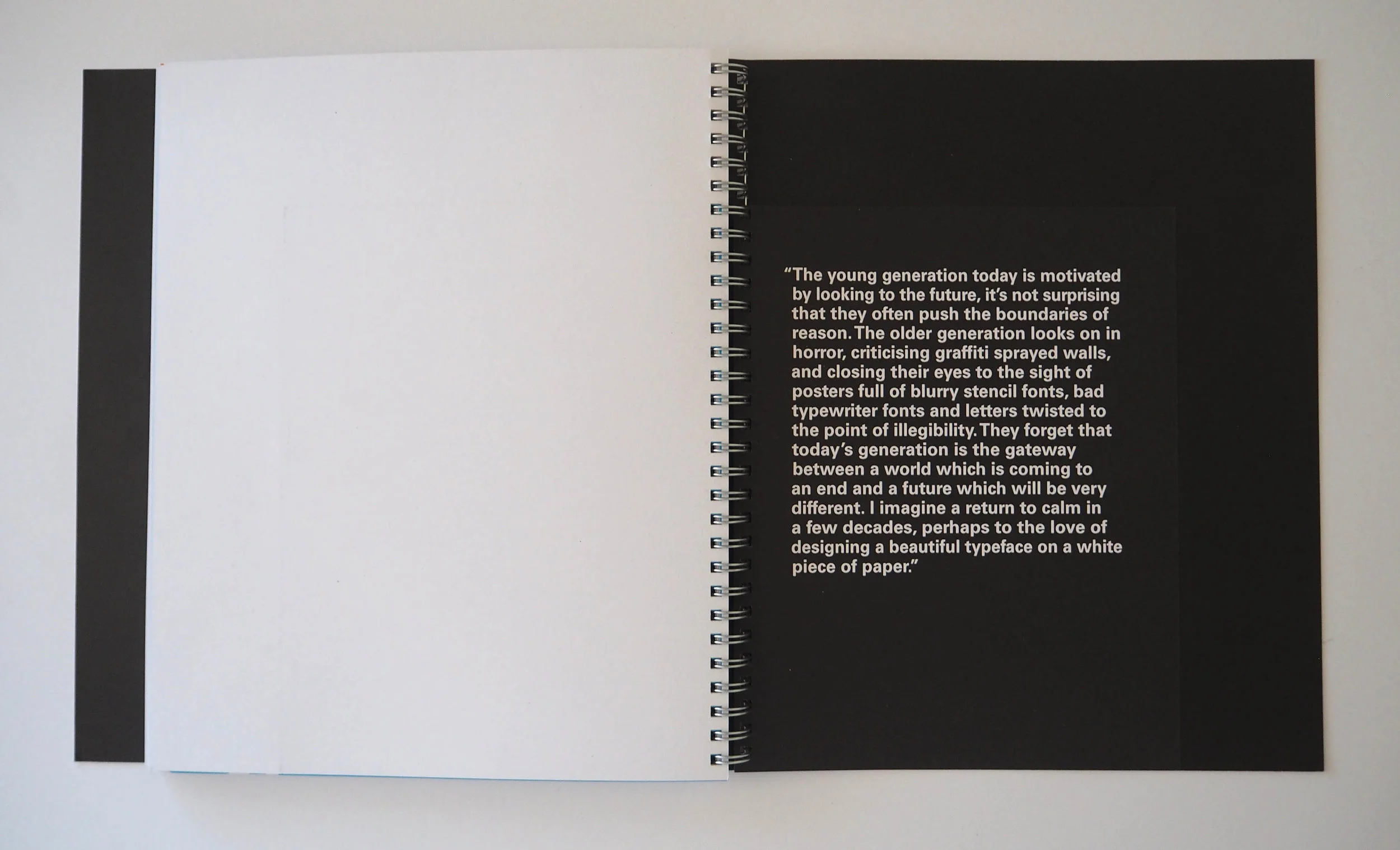
Adrain Frutiger: A Man of the Times
ISTD partnered with Linotype to create the 2016 brief A Life’s Work. The brief was to create a publication celebrating the life and work of Adrian Frutiger, one of the most iconic and successful typographers of the 20th Century.
This book covers Adrian Frutiger’s development as a typeface designer, examining his processes and the philosophies behind his design practice. In-depth case studies of his typefaces are included to show the amount of work and thought that Frutiger invested into these timeless designs.
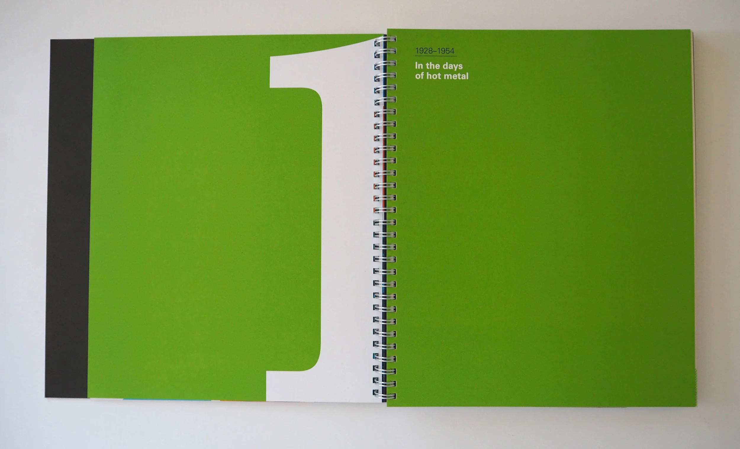
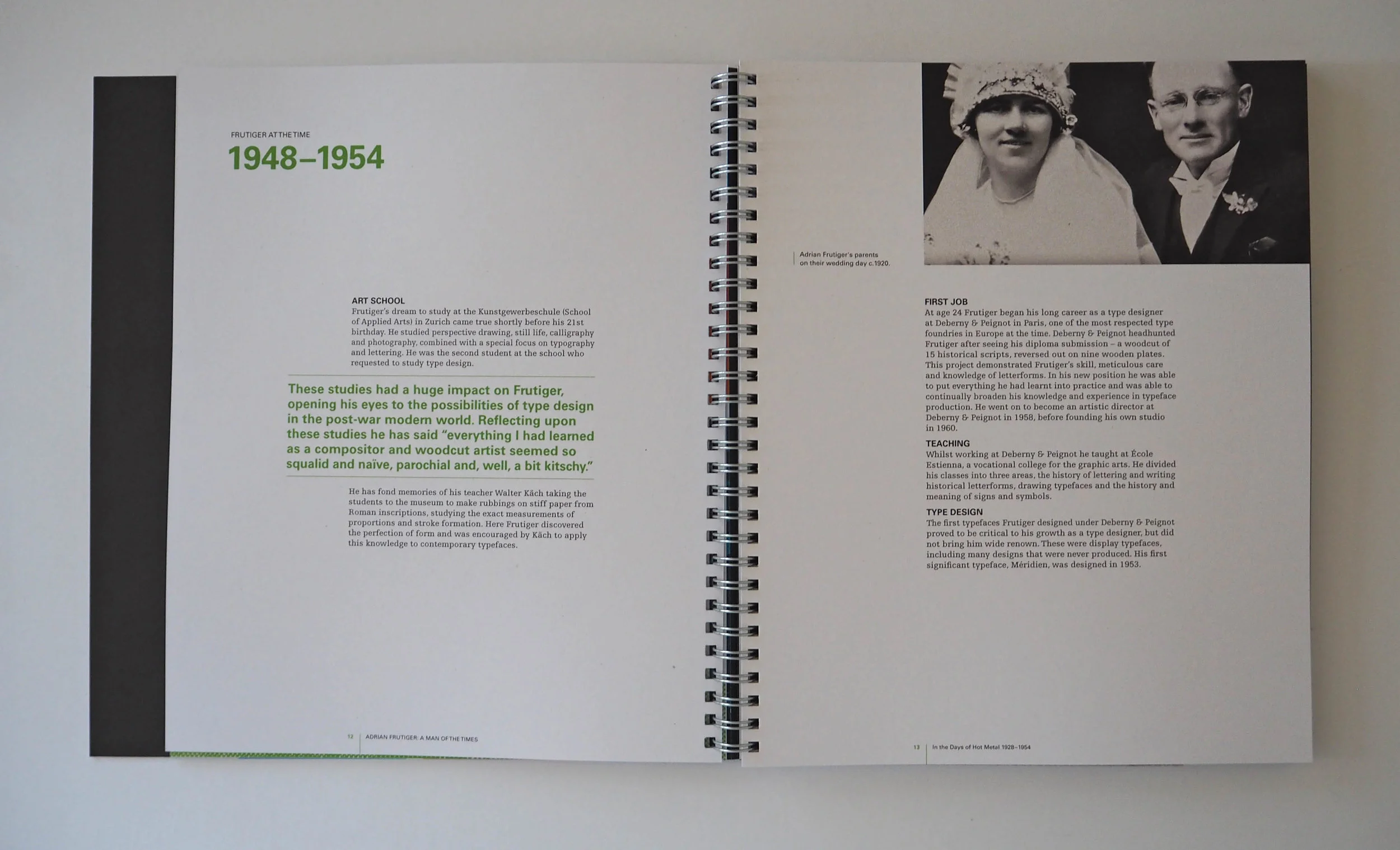
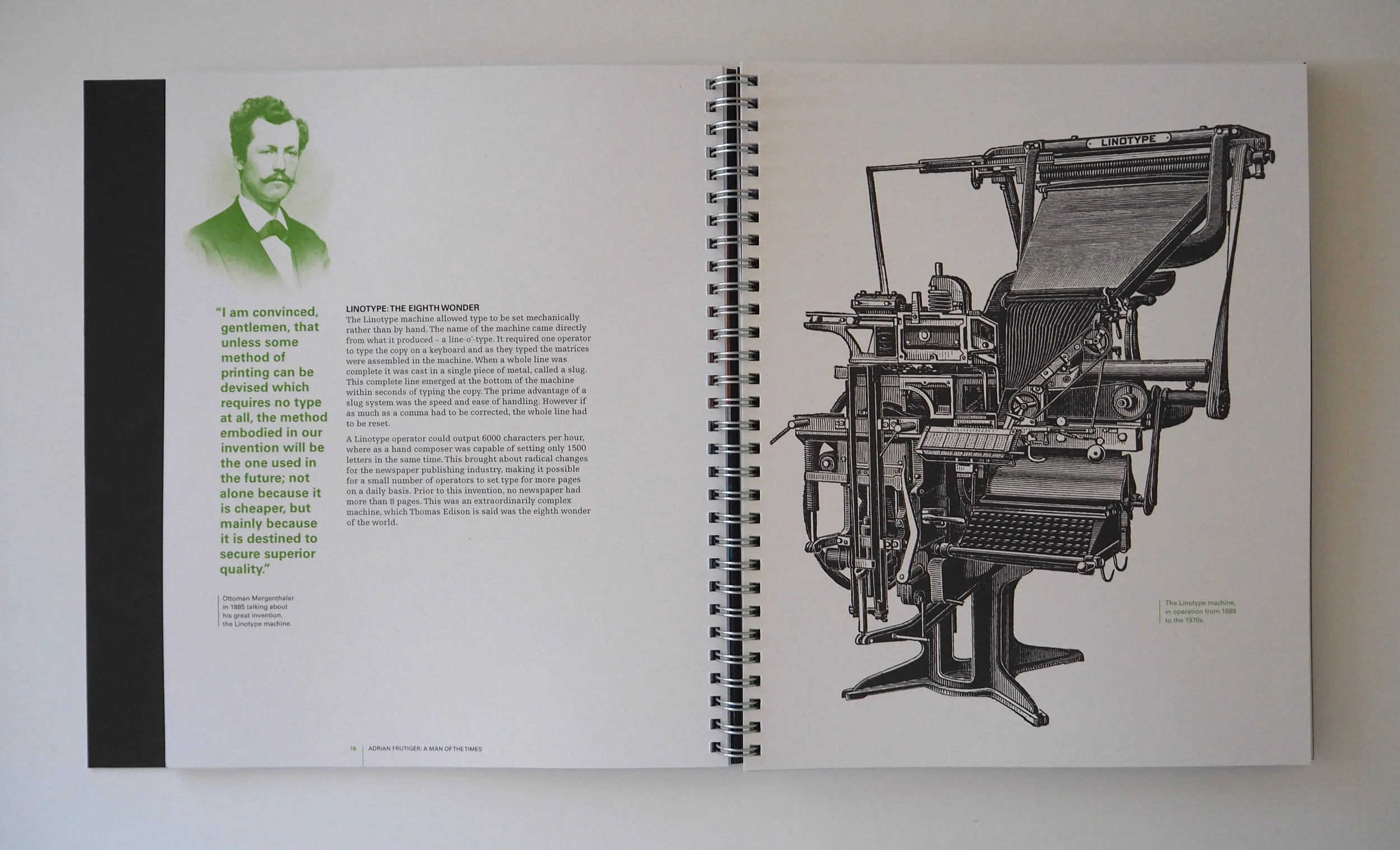
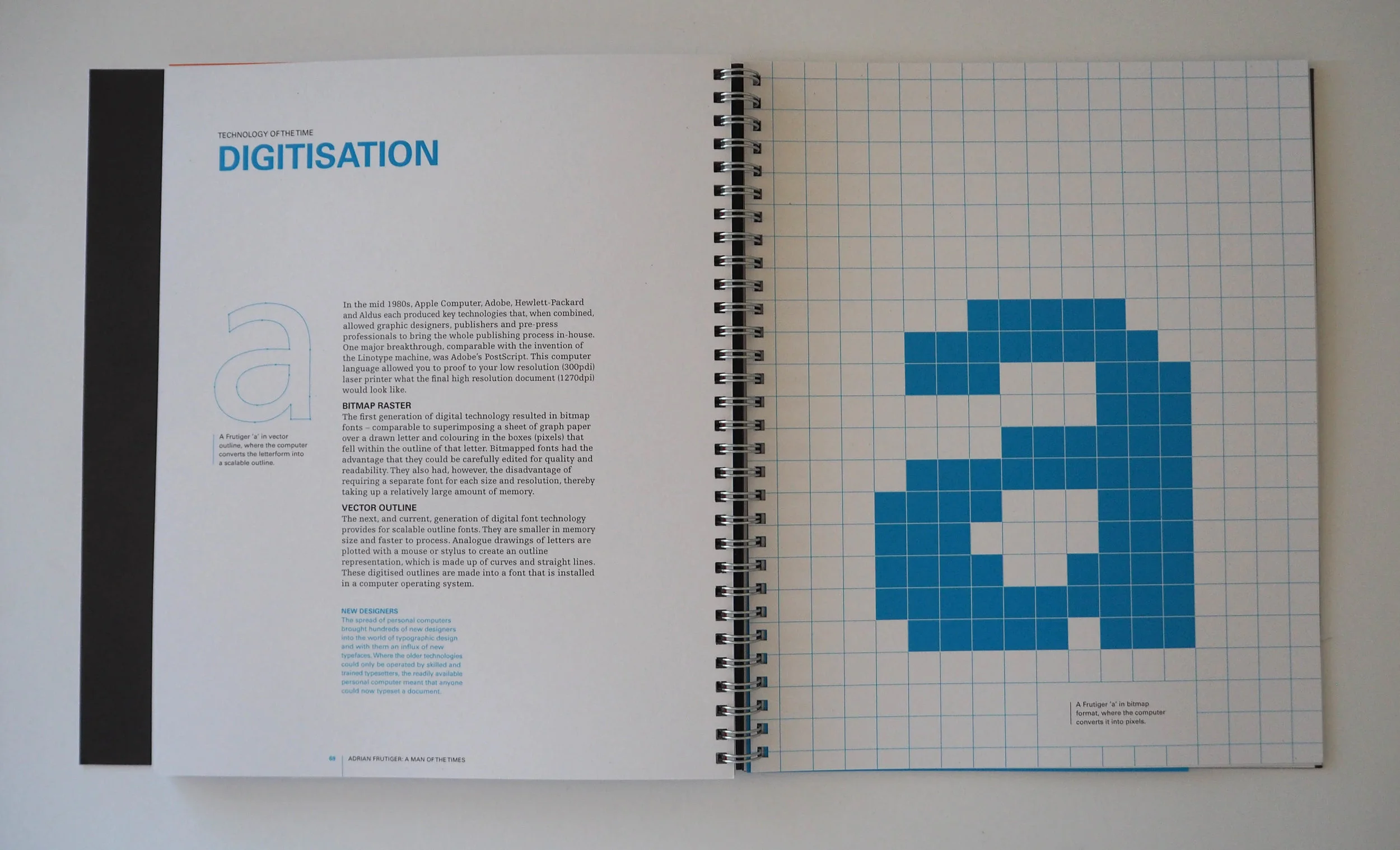
The three printing eras that Frutiger lived and worked in are also explored – hot metal (1928–1954), photo typesetting (1954–1986) and digitisation (1986–2015). This is to commemorate the unique fact that Frutiger was one of the few type designers whose career spanned across these three distinct periods.
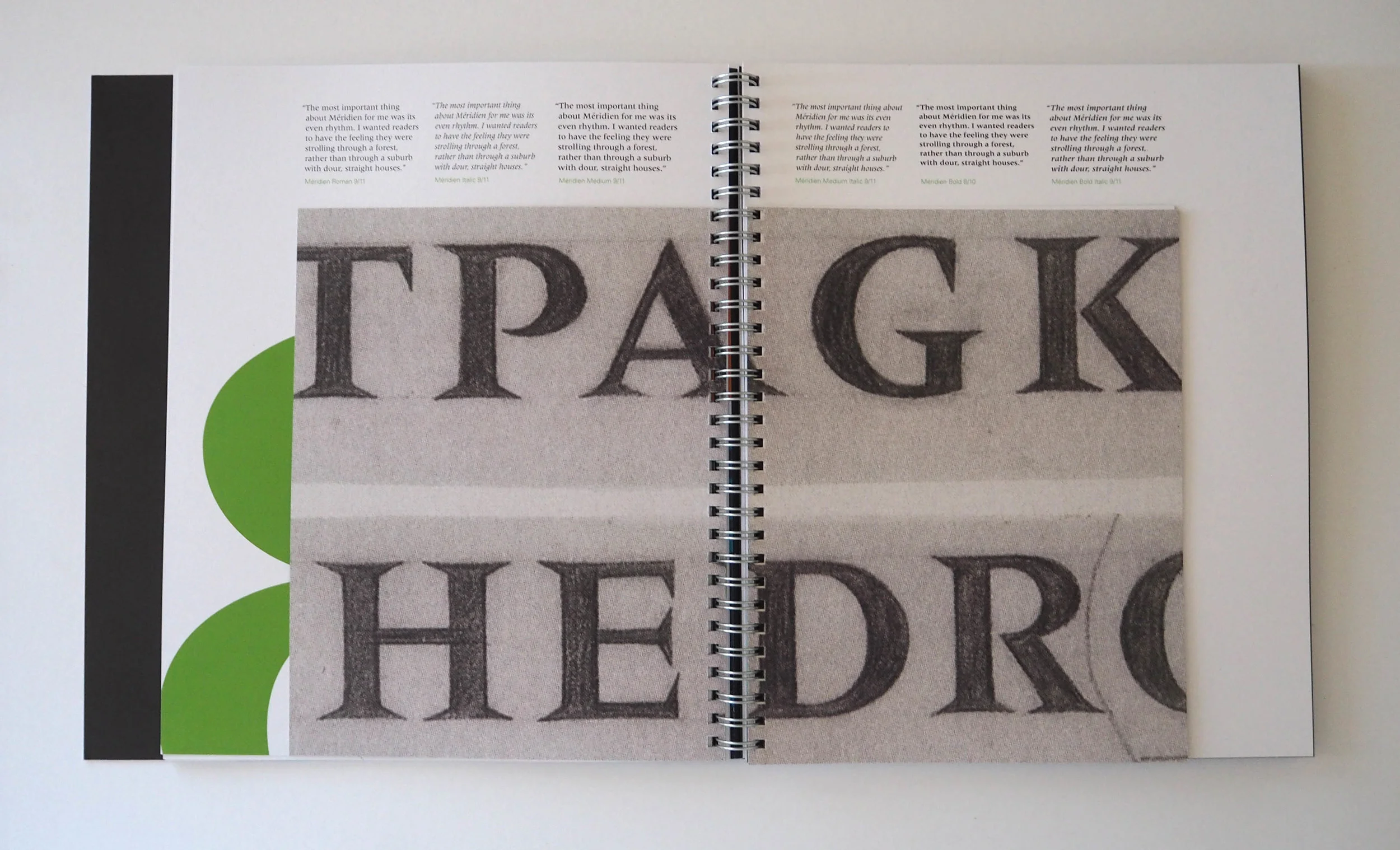
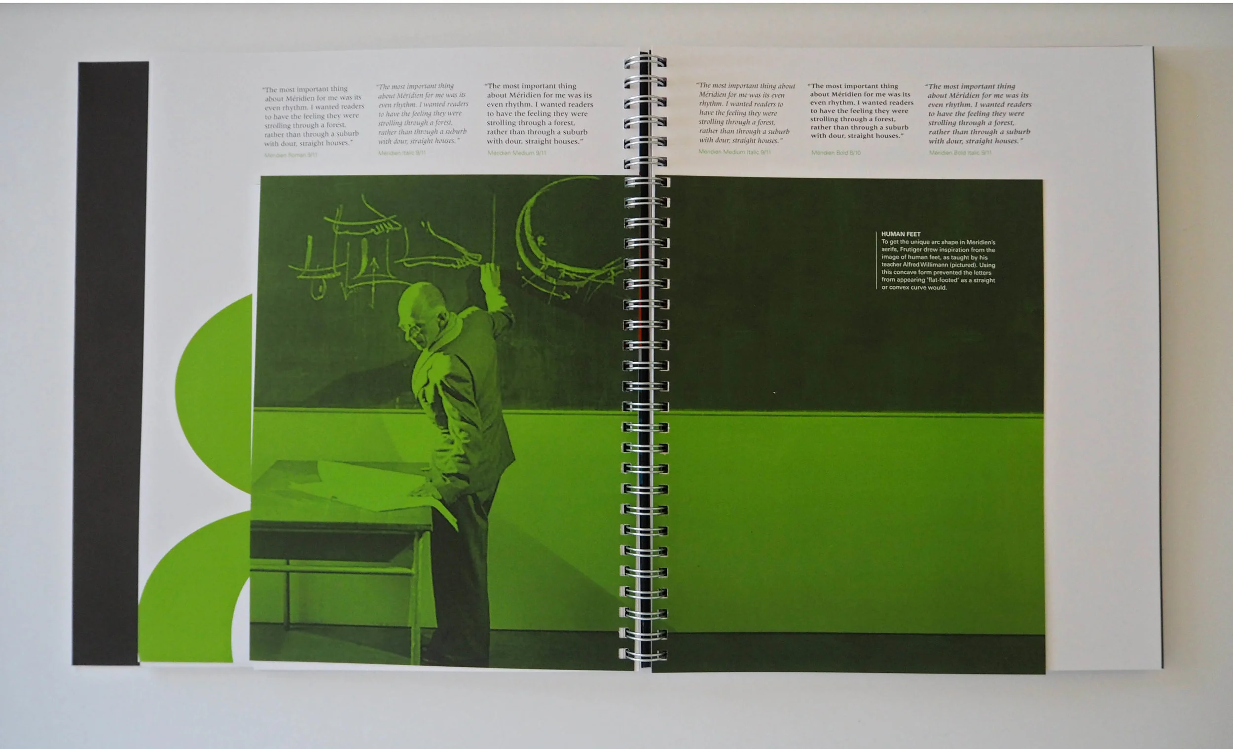
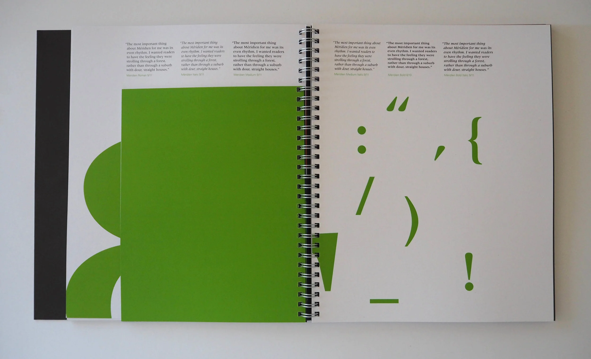
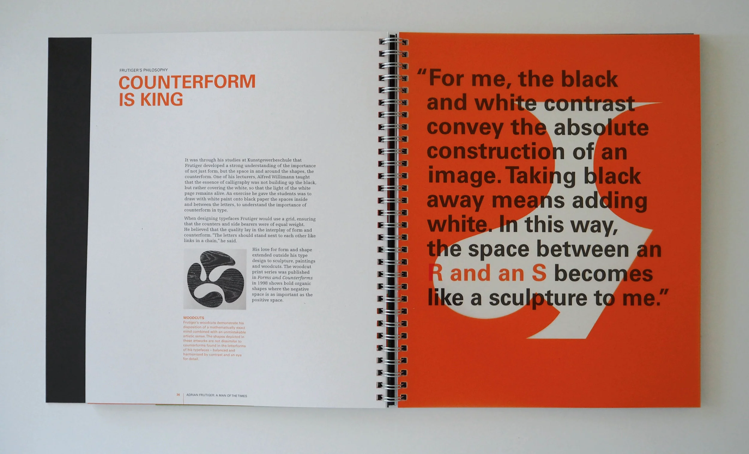
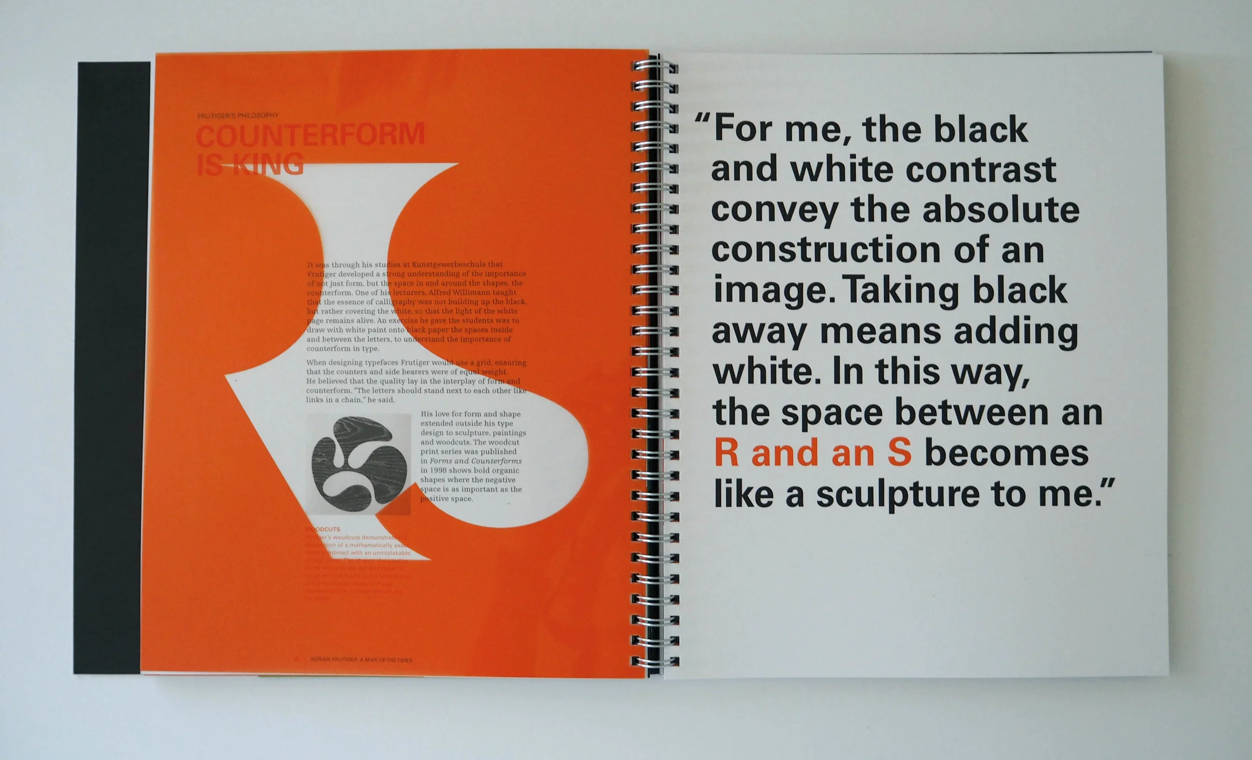
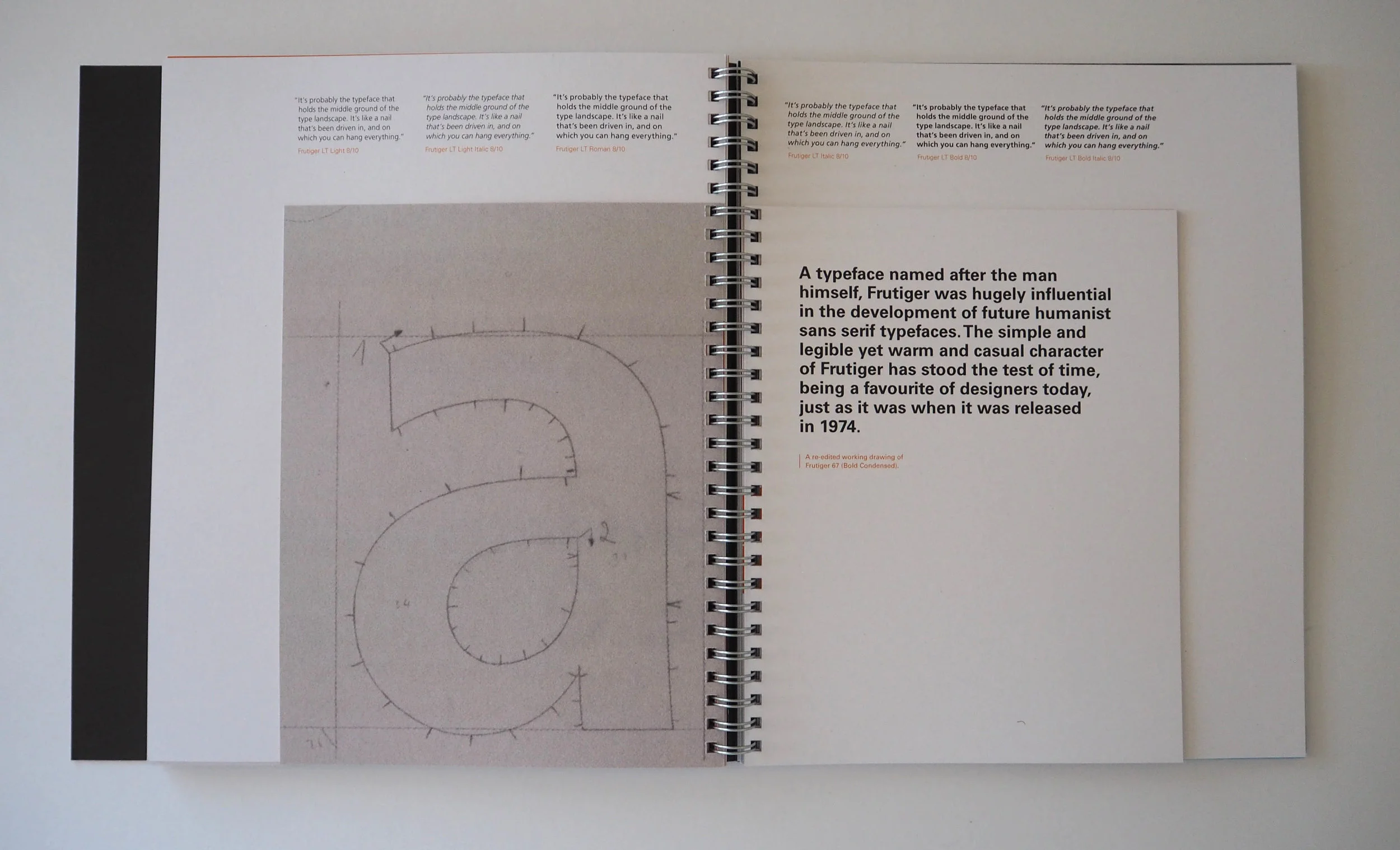
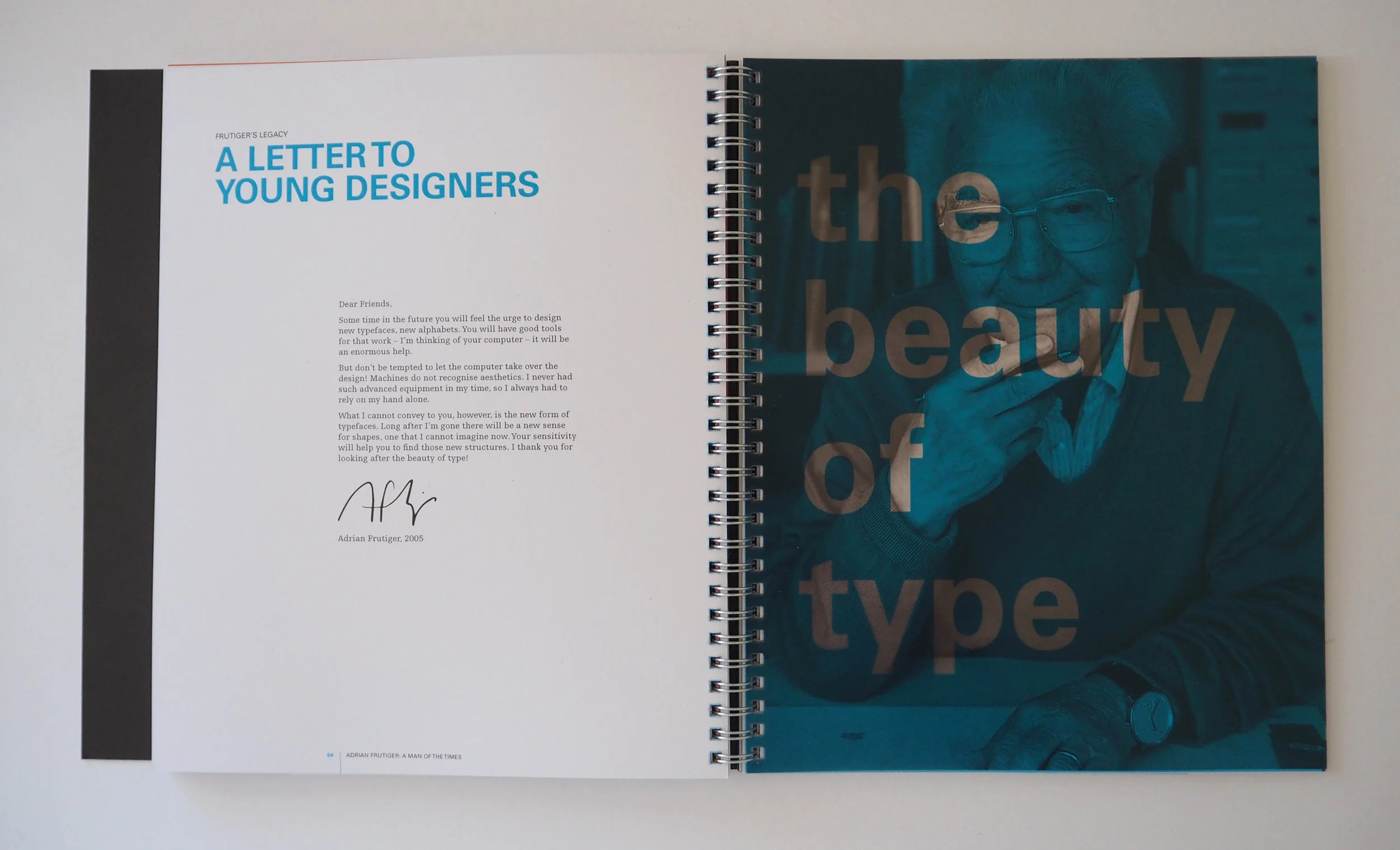
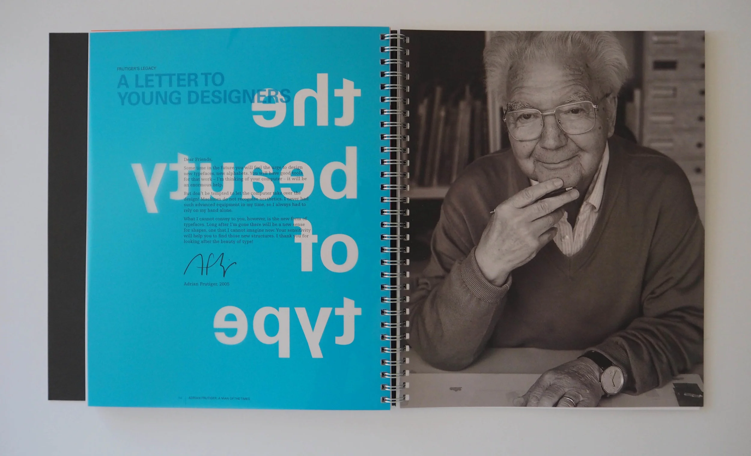
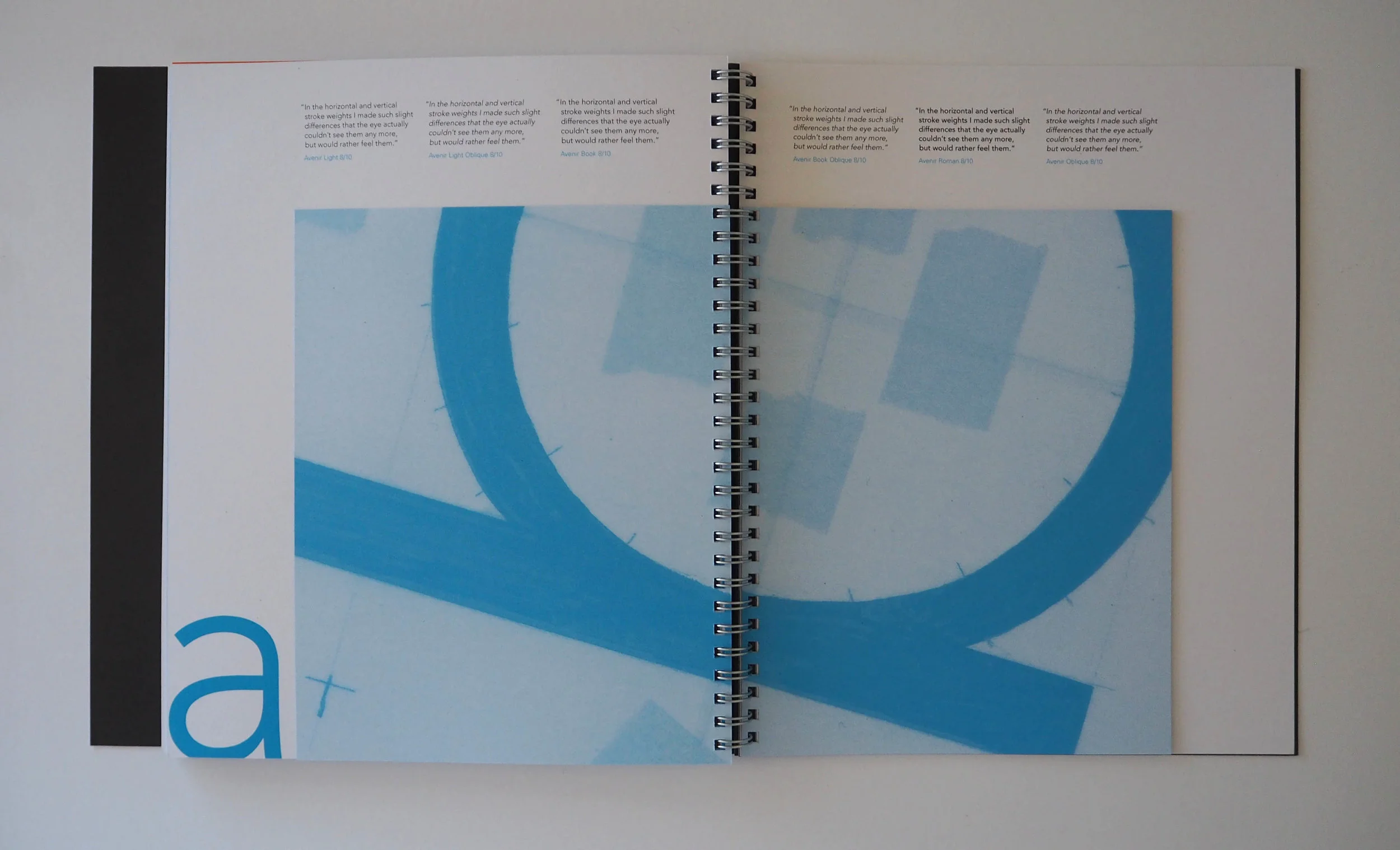
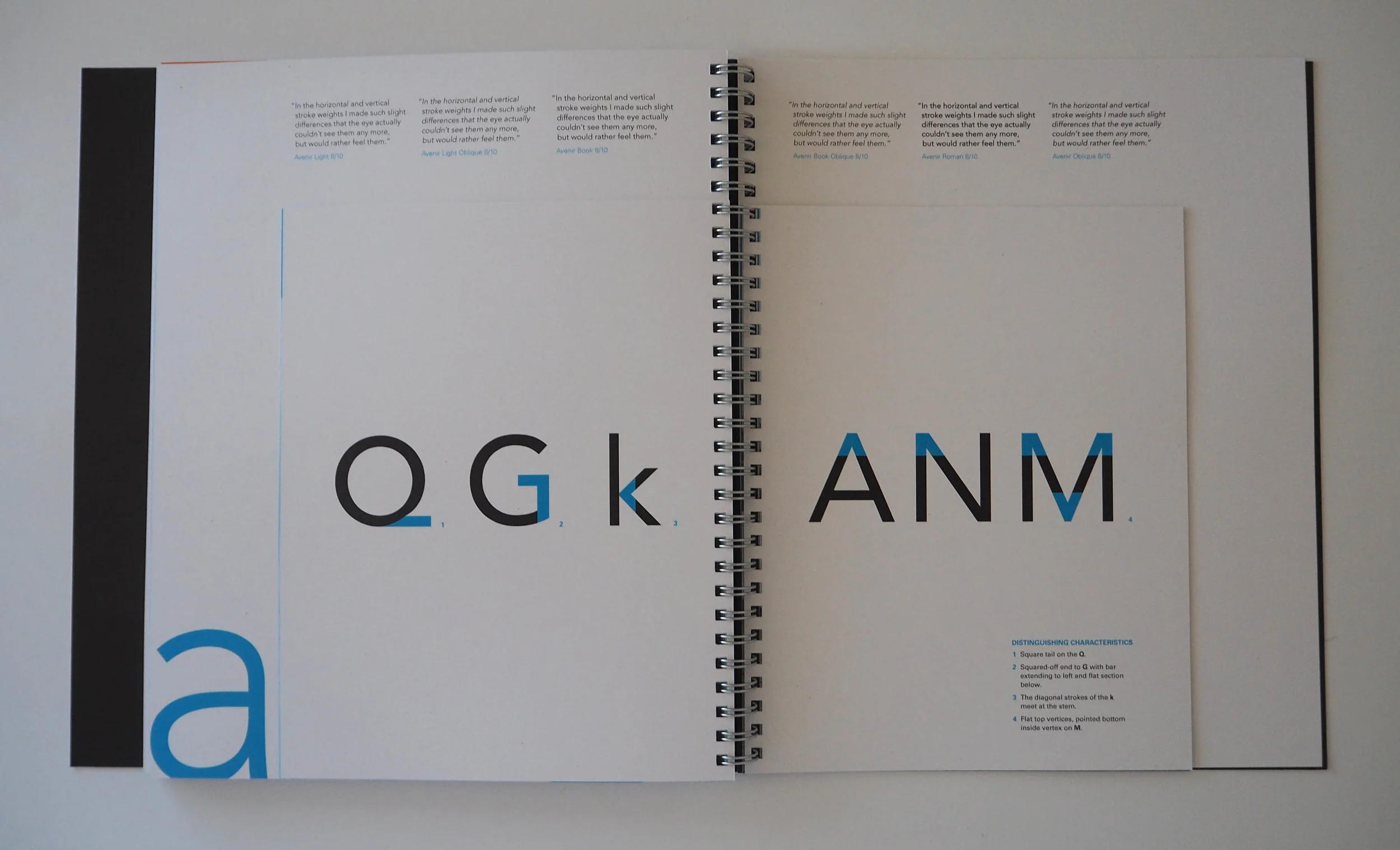
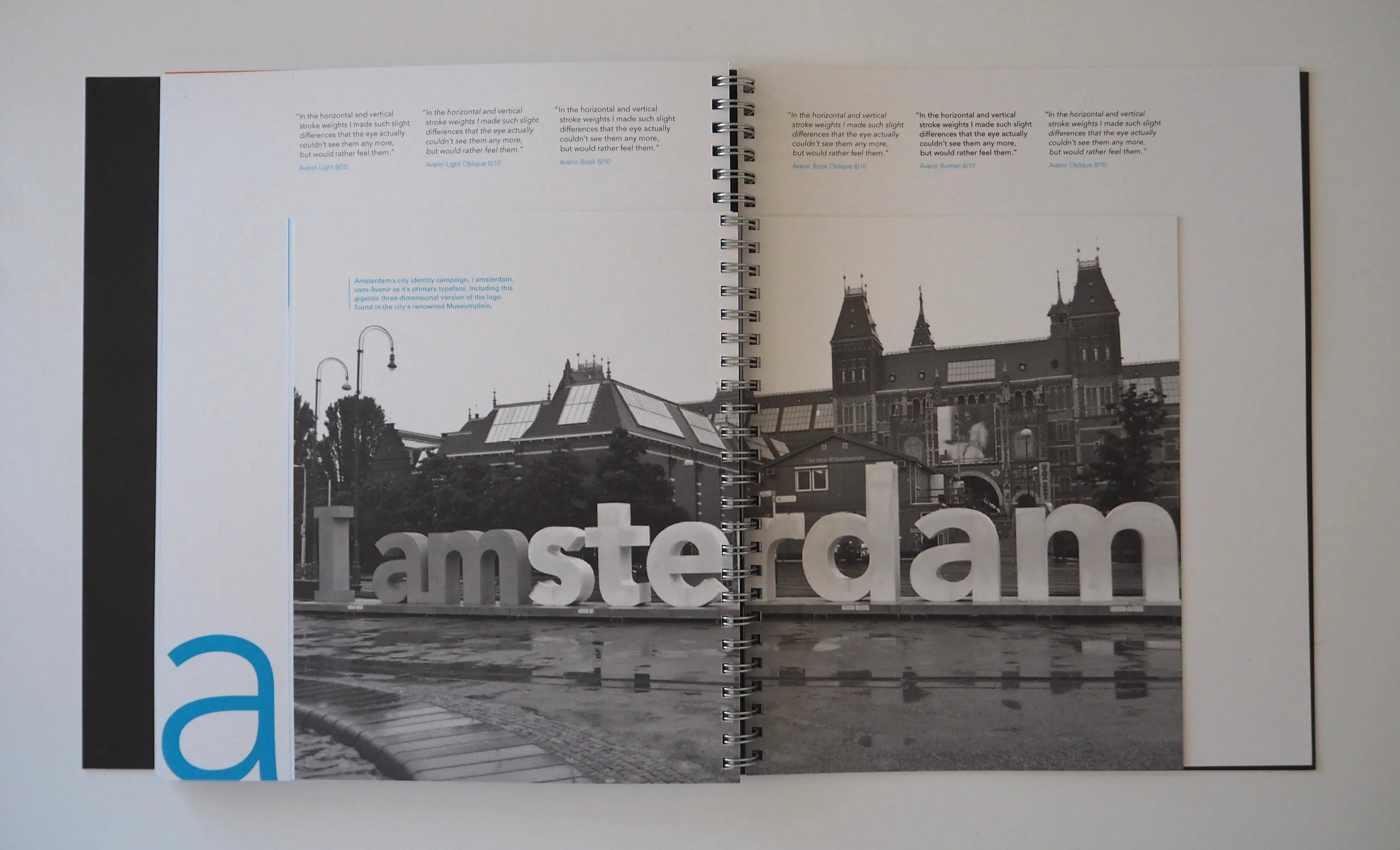
The art direction of the book is influenced by Swiss style design, as Adrian Frutiger had a strong connection to this movement having grown up and studied in Switzerland between 1928 and 1952. Aspects borrowed from this style are the asymmetrical layout; strong use of the grid; inclusion of photographic imagery; wide left margins; colour transparent overlays; big bold numerals and large type in the headings.
The writing and publication design for a competition brief that I submitted to the International Society of Typographic Designers (ISTD),which was awarded a merit.

